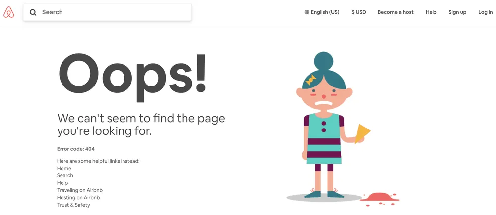
Here are the few things we’ve seen that are (relatively) easy to do, and most likely to have a positive effect on your visitors’ experience.
First of all, make it really clear that your visitor has landed on a 404 page. A simple message like “we can’t find that page, sorry!” is great.
Next, consider adding a few things that will help your visitor get to where they’re trying to go:
Simple sitemap. Yes, you’ll have a navigation bar at the top of your 404 page, as you do for every other page on your site. But a list of common destinations is helpful, too. (A common mistake is to have a fun graphic or other branding that takes up the whole page and makes it an obstacle to your visitor finding what they want.)

Leverage live chat
If you’re using this, make sure it pops up on your 404 page with a helpful message – “Looks like this page went away, can we help you find what you’re looking for?”

Add a search bar
If your CMS allows visitors to search your site, put a search bar on your 404 page.

Promote popular content
If you have introductory content that appeals to a wide range of visitors, consider putting that on your 404 page, as well.

Introduce some personality
Finally, a couple of other considerations that are helpful to keep in mind:
- Periodically, you should check to see how often visitors 404 on your site. You can do this through Google Search Console, or using Google Analytics by searching for pages with a title matching your 404 page title. This is a great way to find pages that visitors are still interested in that may have been taken down or moved. Redirect the 404 URL appropriately.
- 404 pages are a great place for your design team to be let loose to do something interesting. You Need A Budget has a whole playlist! (Which is barely visible because the main graphic is so large. But still!)

A fun 404 page probably won’t help you stand out since they’re so common, but your design team might appreciate the chance to play around with a page that a lot of visitors will experience.
Alternatively, a really boring 404 page might be a little disappointing and off-brand.

404 pages are not critical to your site’s performance, but if you’re looking to be buttoned-up and have as good an experience as possible for your visitors, they’re a great place to add some simple utilities and a little bit of branding.
